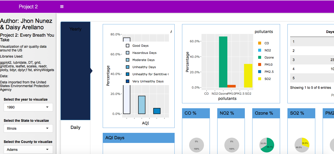
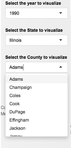
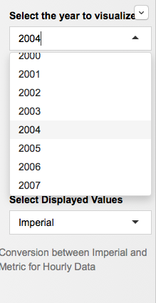
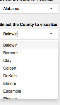
Our application allows the user to start by picking a year, county and state they would like to visualize.
These can be chosen by a drop down menu which updates as the user clicks on a state or year to show only the information for which there exists data.
Our app functions for all years of all counties for yearly and daily data thus fulfilling B and C level requirements about data downloading. Also functions for hourly data which we will discuss later.
(some examples of how a user could and would choose)
|
|
|
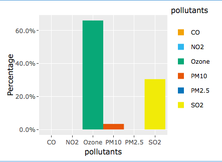
Our application is separated into 3 tabs:
First Tab is our Yearly tab:
All data that uses annual information for a specific county.
The user can interact with both our bar graphs using the mouse to hover and see details about the data. These bar graphs allow user to see the relative days of AQI in a year for a county, and the major pollutants per year in that county as well.
The user can interact with both our bar graphs using the mouse to hover and see details about the data. These bar graphs allow user to see the relative days of AQI in a year for a county, and the major pollutants per year in that county as well.
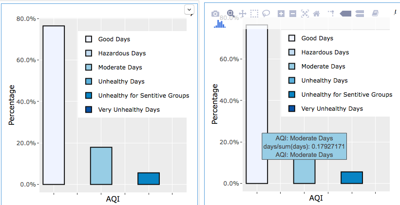
(hovering mouse caused info to display)
|
|
These bar graphs are also visualized through pie charts for which each pollutant has a pie chart as well as the AQI data.
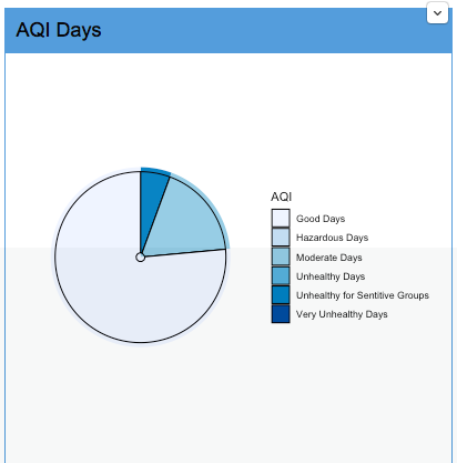
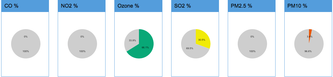
(notice these colors also map to the colors on the bar graphs)
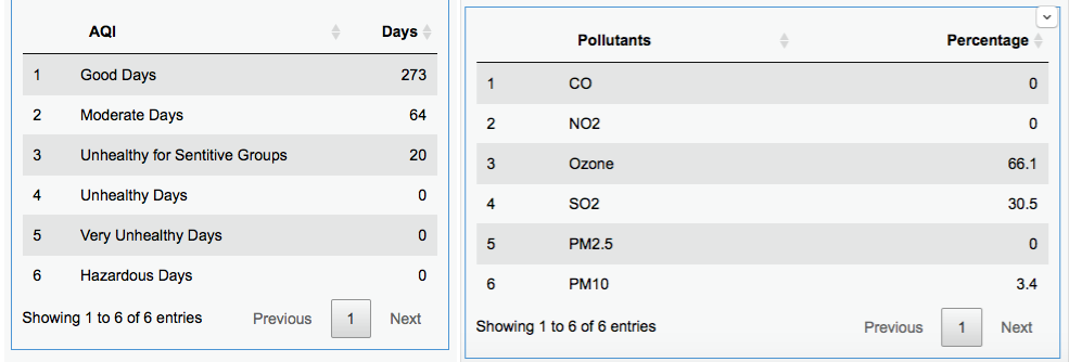
We also have tables which display this information more directly.
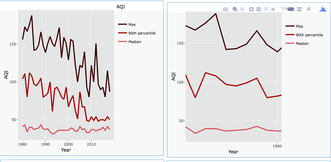
The most interactive part of our dashboard "Yearly" tab are our line graphs. These do not show information for one specific year and instead show information for all years. Since this is more information we also allow the user to zoom into a specific range of years too look at the data a little closer.
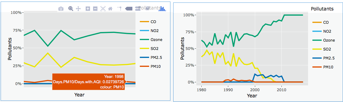
(again hovering over our data will show you more information)
Our next tab is our Daily Tab:
The second tab consists primarily of three visualization types.
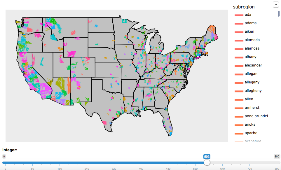
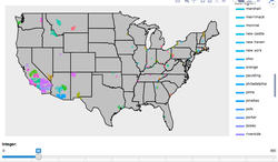
The first are 2 maps. Our first map allows to choose a pollutant to visualize. The user can choose from a list which then will automatically show them the 100 counties with the most problems with that pollutant. This number can be changed by the user based on a slider at the bottom of the map. Each county is shown in a slightly different color (note this is not based on toxicity level it is simply to differentiate counties. We then also have a legend which allows the user to see which counties correspond to which color. Since these colors tend to be close to one another we also allow the user to tap on the name of the county on the legend to make it disappear. If user double taps they can see only that county on the map. This allow users to focus on one county if they would like.
This is our C level requirement map but enhanced to fulfill b level requirement as well.
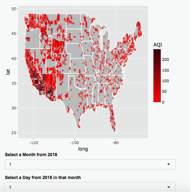
Our second map is a heat map. This map shows the median AQI data for a day in 2018 chosen by the user. All information is in the range of a scale that changes based on what is available. Information that is unavailable is gray. This was the map requested for an A which allow the user to show a heatmap for any of the pollutants for a given day chosen by the user in 2018.
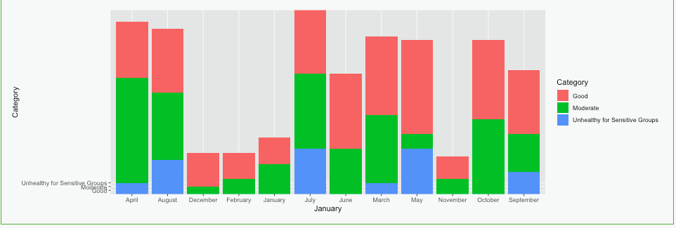
Next we allow the user to see a stacked bar chart and table for each month of that year showing the number of days where the AQI was good / moderate / unhealthy for sensitive / unhealthy / very unhealthy / hazardous / unknown
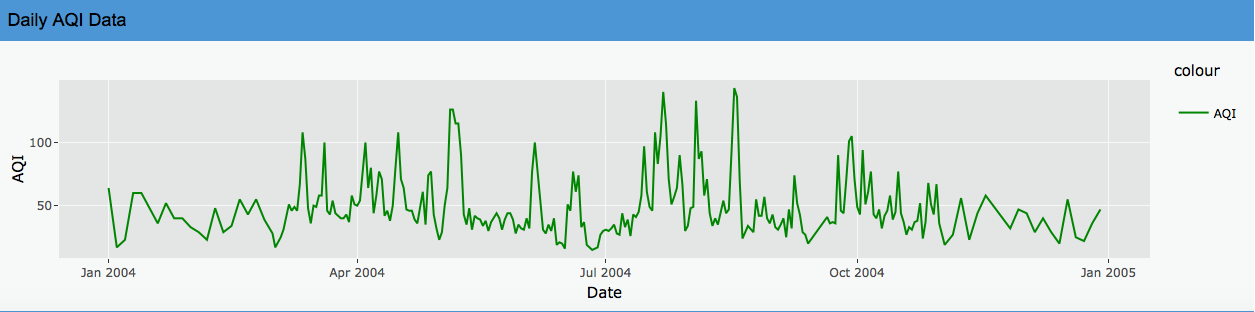
We also allow the user to see the daily AQI data for that year as line chart and see what pollutant was contributing the most to the AQI for each of those days
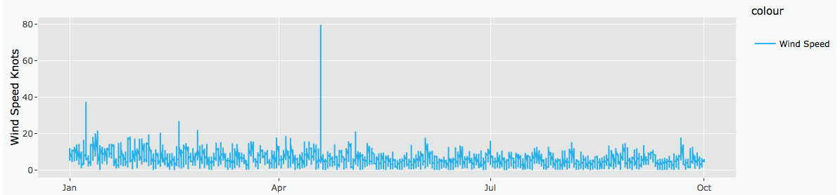
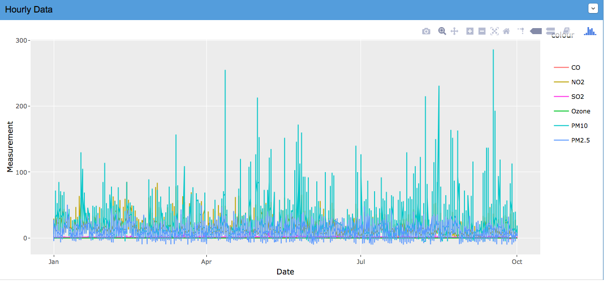
In our Hourly Tab:
choose if they would like to visualize in metric or imperial units
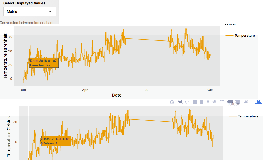
The line graphs we created for this page allow the user to see the difference when units change and allow the user to choose a date in some intuitive way that shows which days have data and then allow the user to pick any subset or all of hourly Ozone, SO2, CO, NO2, PM2.5, PM10, wind, and temperature and show them.