Viewers Choice: Justice Map
What does this visualization show us?
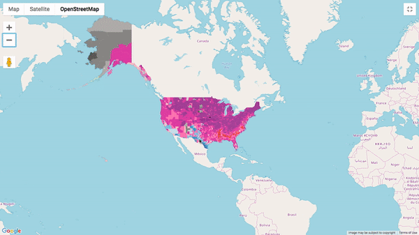
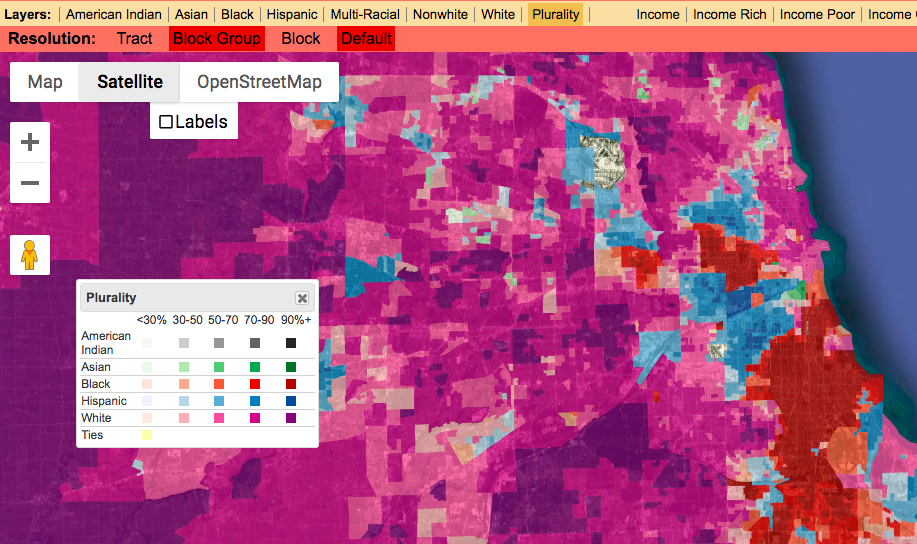
This map has several layers which the user can activate. The layers include at the most basic level, Race and income. We can choose one layer at a time but there is a Plurality setting which shows all races at once.
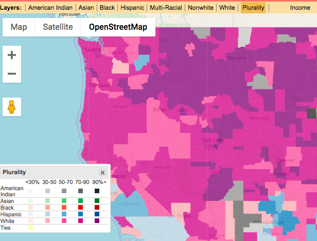
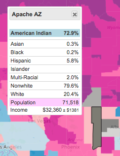
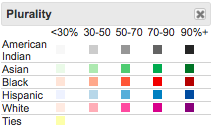
we can see the different races in the top right and the legend for those races on the bottom right.
|
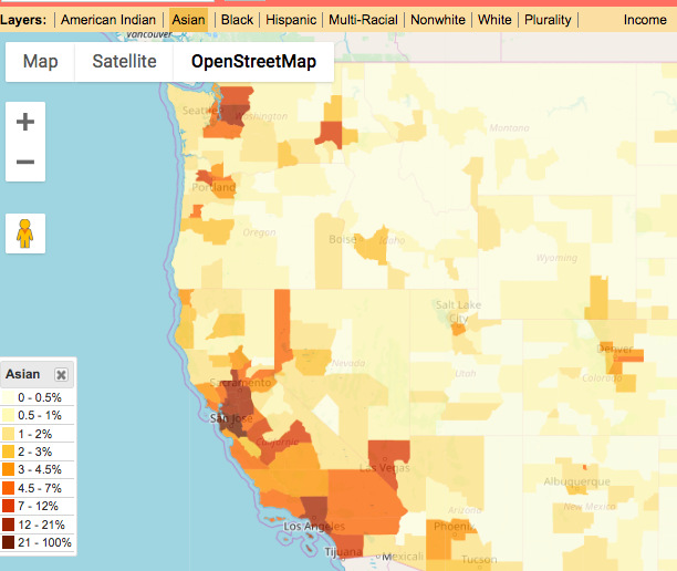
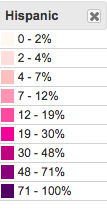
When a specific race is chosen we can see the percentage of those races displayed.
|
Note: with each layer we get a different legend. This is an interesting and important design, when looking at plurality we are looking at a heat map of many different races, where the majority is being represented as well as their percentage in that area. When looking at a specific race we are only seeing the heatmap for that race represented on the map, making the legend a lot more simple as it is easier to visualize. It is difficult for plurality to map everything as, we are recieving a lot of information at once. The importance of seperating plurality from singular race layers is to be able to see populations of minorities throughout the US instead of focusing on the majorities in each county. Both may have different use cases and are important.
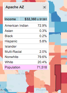
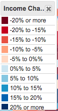
The user is able to see two aspects of this map, race and Income. Following are the ways to visualize income.
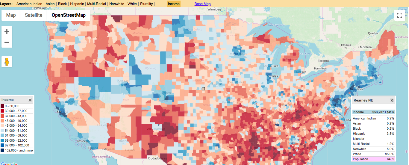 Here we see income visualized
|
|
Every visualization will also allow user to click on a specific region to get more information. This is a good way to see trends and patterns by keeping the location controlled and viewing the racial makeup and income of that location.
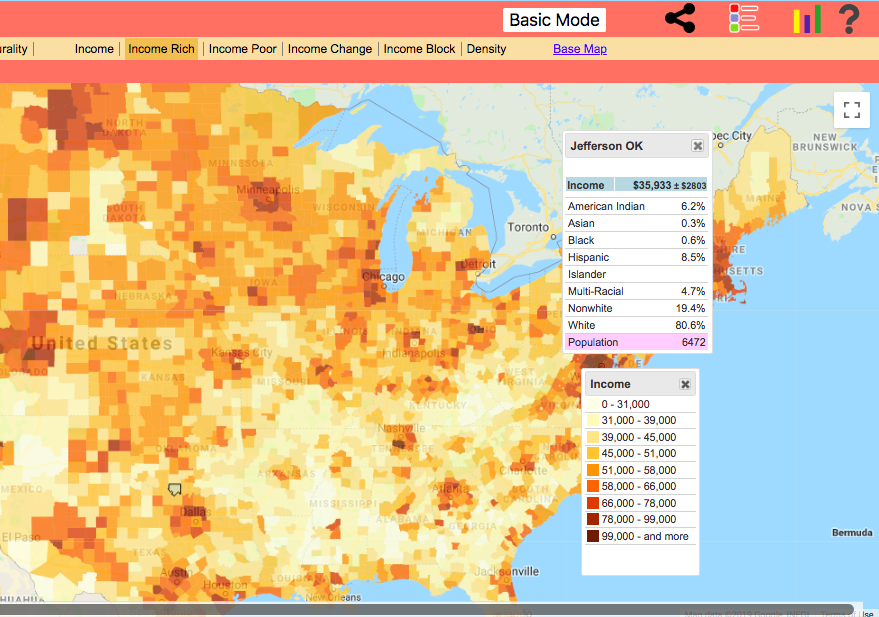
Checking advanced mode gives us the option to add layers of income similarly to race. We can now focus on rich, poor, or change in income. We can also check Density and Income Block.
|
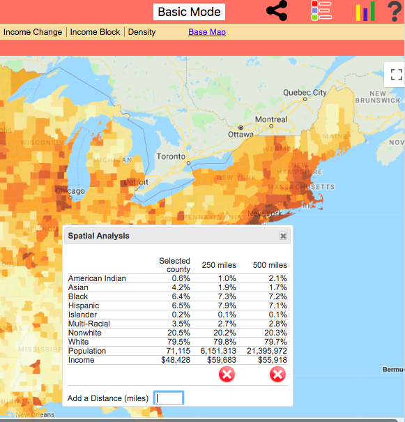
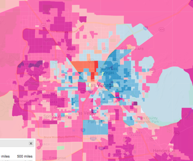
We can also check spatial analysis using the 3 stat bar icon on the top right. This shows us the areas near by and their information based on distance which can be set by the user. It is shown to us in the form of a data table.
|
I will get into more detailed functionalities and layers later. For now I will say that this information is interesting to view with different layers. This map can be used by those who are not well versed in big data visualization to create maps which analyze race and income for the entire state, a city or even a neighborhood. The separation of layers is pretty intuitive as to allow any user who is not coding savvy to create their own custom map. The additional table also allows the user to see in greater detail if they need to check any specific statistics. In this way, the map visual shows us general trends, and the statistics on the table allows for more in depth analysis.
Where Does This Data Come From?
All information comes from the Census Bureau - the 2010 Census and the latest American Community Survey (five year summary)
How Can We Learn from This Data?
We can use different layers to learn more about different areas. Some of these layers lend themselves to looking at cities and more specific regions while others lend themselves to noticing more general trends like the entire country or maybe the West or East coast.
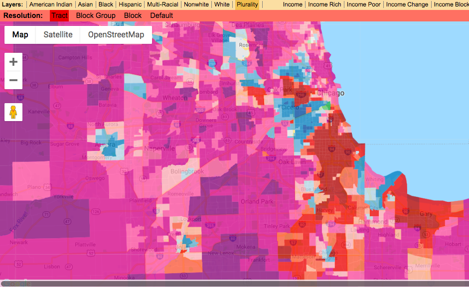
Here we see the default tract layer activated
|
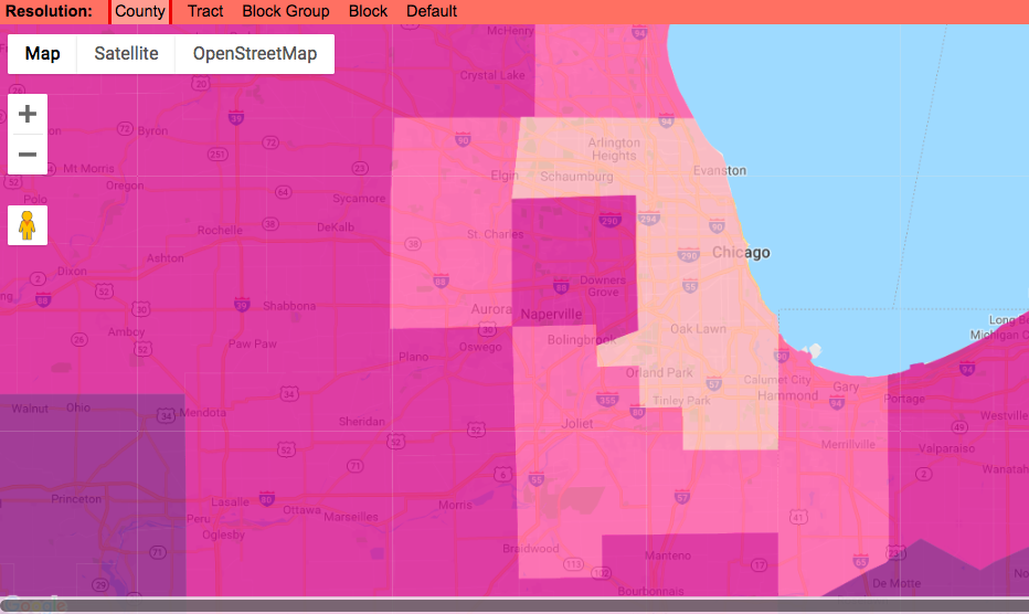
Here we see the county layer activated
|
Here we see the block layer activated
|
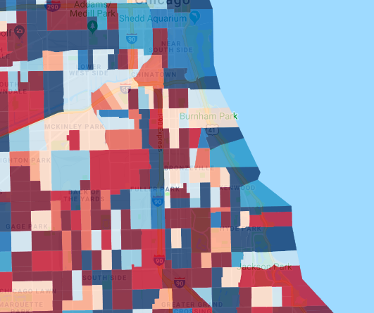
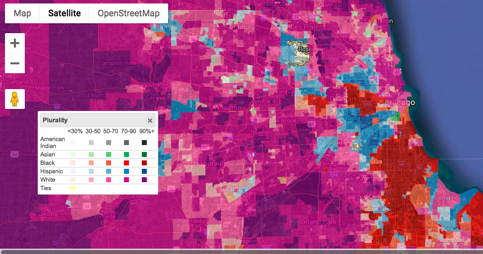
We can see for example that the city of Chicago at a county level looks pretty diverse as the county is a neutral shade, and when we close up on the cities we can see where different races tend to live. This shows us the segregation that exists in Chicago. Let's look at some other major cities and see if this trend holds true.
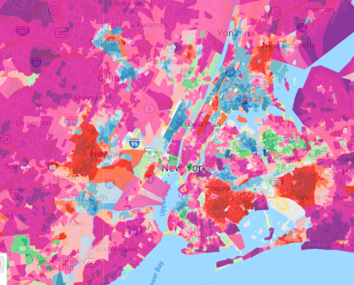
Here we can see that although there are some areas of segregation in New York it is slightly less segregated than Chicago.
|
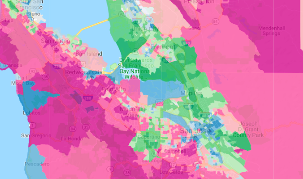
Here we see much less groupings than in New York or Chicago but we also see much less diversity in general.
|
Here we see segregation similar to Chicago with a more defined line down the middle of the city.
|
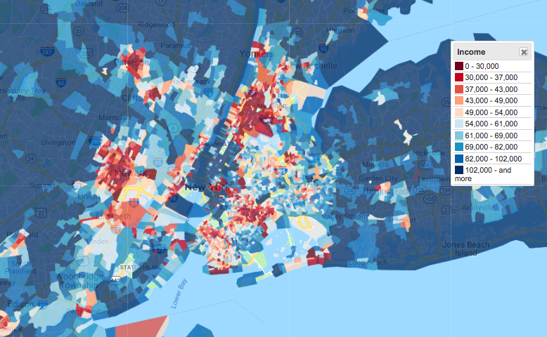
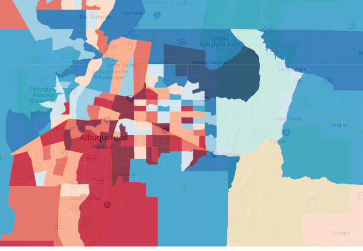
So we have seen the racial segregation of this city, now let's see what the income looks like for these same cities and see if we notice any trends.

|
|
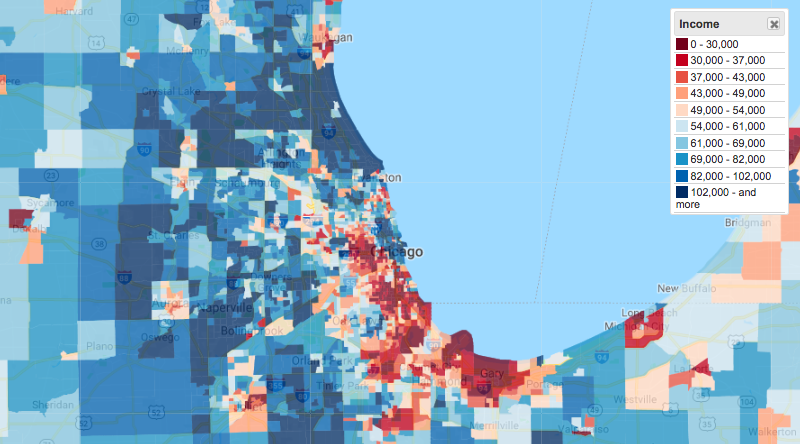
Starting with Chicago we can see that the income breakdown follows similar trends, where there are blocks with very deep shades of blue and deep shades of red grouped together and they are pretty segregated. The closer into the city and especially in the South side we can see the deeper the shader of red. When we get to the outter city we see some deeper shades of blue as well as on the North side near the lake. This makes sense when we think about the price of housing near the lake versus on the South side. How does race play into this though? Well housing on the South side near the lake should be just as valuable as the general real estate offers the same distance from down town, a view of the lake. However, gentrification tends to raise these prices. Gentrification usually comes with people of higher income moving in and taking over an area therefor making rent higher for the rest of the neighborhood due to its percieved value. Usually this percieved value comes from surrounding neighborhoods which would explain the groupings of income. Additionally we can see the breakup of districts and precincts as well, Chicago neighborhoods tend to suffer from lack of funding or prioritizing rent control in districts and wards led by aldermen who welcome gentrification. These precincts and wards are also susceptible to gerrymandering. We can see that race and income line up almost exactly as well, with higher income neighborhoods tending towards being white and lower income being majority Hispanic and Black.
In California we can see one flaw in how income is mapped, in California most people can not live off of less than 50k withouth being homeless and thus probably not filliing out a US census bureau. This means that the entire state looks as if everyone is wealthy.
|
In New York there are still areas of poverty and similarly to Chicago some trends when compared to our race layer. We can see that there is more of a distribution but if we looked at rent in the bluer neighborhoods the patterns of gentrification would probably be very similar.
|
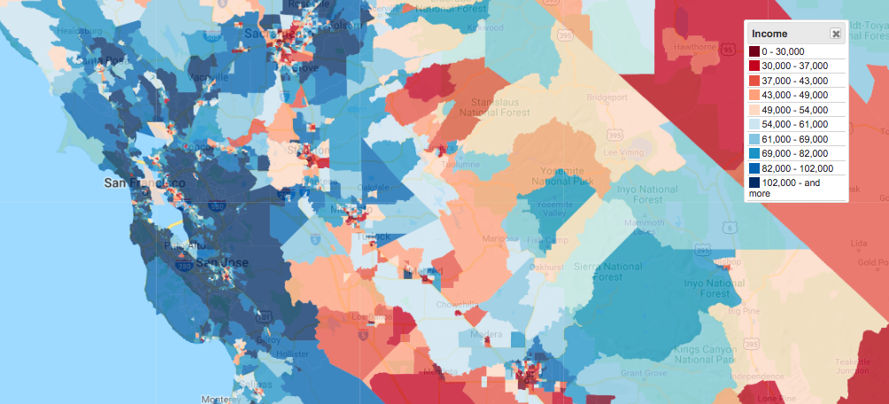
Here we can see a much clearer picture of wealth distribution because there are less smaller neighborhoods. There seems to be less drastic changes in income than New York or Chicago but we still see there are areas that general stick to a color scheme.
|
This data may seem intuitive to those of us who have lived here our whole lives. Yet there has been a lot of research done in this area and articles tallk about how the most diverse cities tend to be the most segregated, and if we look into some of the cities and the laws they implement to try to prevent this we can gage how they work especially in specific neighborhoods (as usually cities do not have one common law under which they all practice to prevent rent from sky rocketing or underfunding towards the neighborhoods).
How Affective are These Visualizations?
 Unfortunately this does not work when you zoom in closer to lookk at specific neighborhoods so maybe we can use it to look at the bigger pictures and notice trends in what areas of the city are gaining/lacking in resources and funding but we can not look at specific neighborhoods. Unfortunately this does not work when you zoom in closer to lookk at specific neighborhoods so maybe we can use it to look at the bigger pictures and notice trends in what areas of the city are gaining/lacking in resources and funding but we can not look at specific neighborhoods.
|
We can see that from a distance we can see income change and that is a good visualization to have if you are trying to find areas that are being gentrified or may be suffering from lack of funding or maybe closing businesses.
|
When working with plurality we can see that the chart displays intensity using monochromatic heatmaps based on majority. This monochromatic design is helpful to avoid complications for colorblind people. It is difficult however since they are mapping by race and population so they did use colors that may be hard to differentiate by colorblind people such as red and green. This is something that is difficult to avoid as intensity is being shown through shade so finding contrasting colors is a little more difficult. It is also nice that as we get to lower percentages we see the colors be harder to differentiate, this is intentional, as a lower percentage means that we are closer to a tie and so there is no majority per se.
|
Here we see income change and income in general using deep red as the lower end and blue as the higher end. This also uses shades of those colors and red and blue are highly contrasting while avoiding the color green to make it color blind friendly.
|
When choosing a specific race you also see the same monochratic design, this is consistent throughout the visualization and is helpful in being colorblind friendly.
|
|
|
This map also allows us to view it in different formats and slightly customize by added or removing labels, or terrains. This can be helpful as you get closer to cities which have a lot of information at once (smaller negihborhoods, parks and highways may be stepping over each other) and you want the person viewing te map to focus on the bigger picture.
How Does this Cater to Target Audience?
According to the creator of this visualization it allows for users to
- Visualize race and income data for your neighborhood, county, state, or the entire US.
- Share a custom map with your friends.
- Journalists, bloggers, activists, and others can create maps for their online or print publications.
- Map makers can add race and income layers to their maps.
- Spatial Analysis. Advanced mode lets you compare who lives within 1 vs 5 miles of a location (and more!).
This is why the map is so customizable because it is meant to be shared. User can easily add layers, move the legend, change the view, and focus on certain races or income brackets. Adding these layers and sharing them allows for them to be used in articles, and for research.
